Like most software, Slack developed over time adding a slew of new features like Huddles, Canvas and workflows. But like any piece of software that is over a decade old with all of those new pieces, it makes sense to revisit old design decisions, especially in the context of being an enterprise communications tool that is now part of the Salesforce ecosystem.
To that end, the company announced a major makeover today including a dedicated way to track direct message threads, while generally making it easier to see what information is relevant to you and your job.
Slack’s chief product officer Noah Weiss, says that the product has changed and the product team wanted the interface to better reflect where the product stands today.
“We’ve added a lot more tools and capabilities into the core Slack product that really has evolved from being a collaboration tool to a full-fledged productivity platform,” Weiss told TechCrunch.
The problem is that the interface hasn’t been able to keep up with making those tools accessible and easy to access, and the product team wanted to fix that with new interface overhaul.

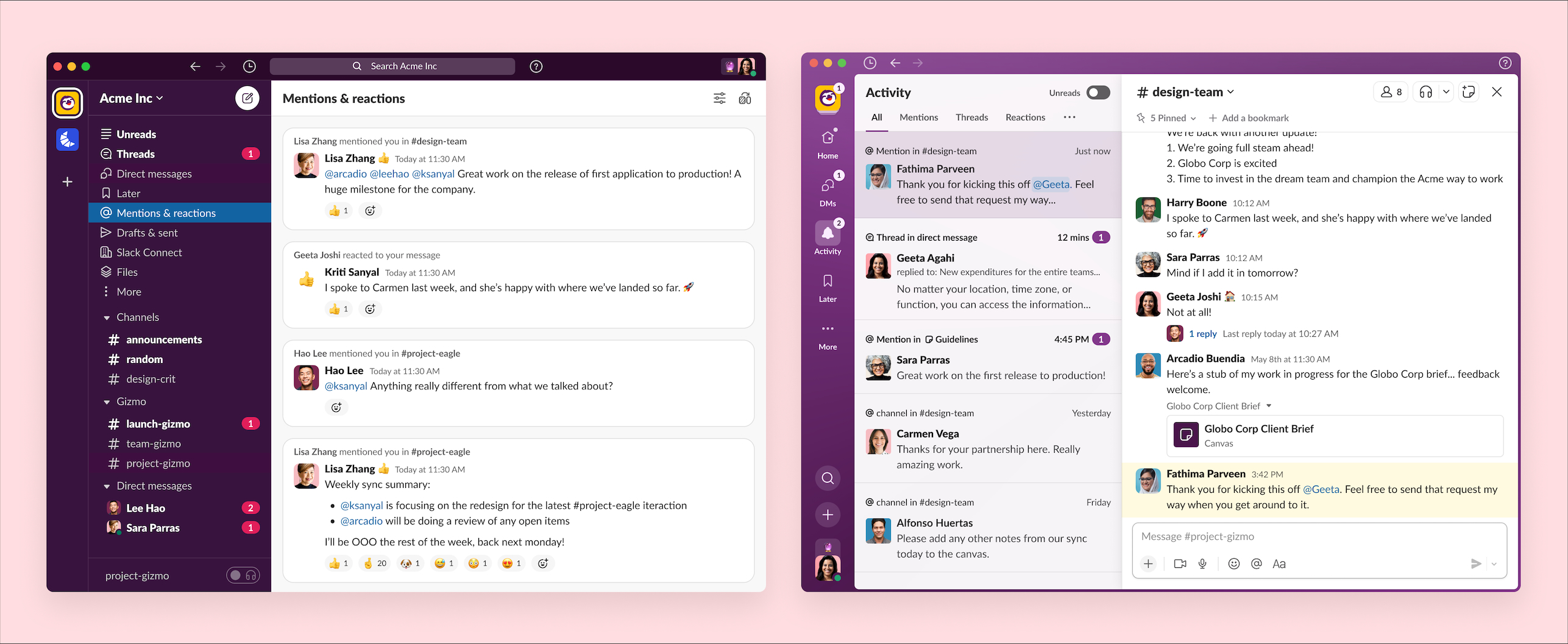
The old Slack interface is on the left. The updated one is on the right. Image Credits: Slack
Beyond the tools issue, especially as part of Salesforce, the company is working with ever larger companies with thousands of people on the platform. At this scale, it has become harder to pinpoint the information that is important to an individual employee or team, and Slack wanted to make it easier to surface that.
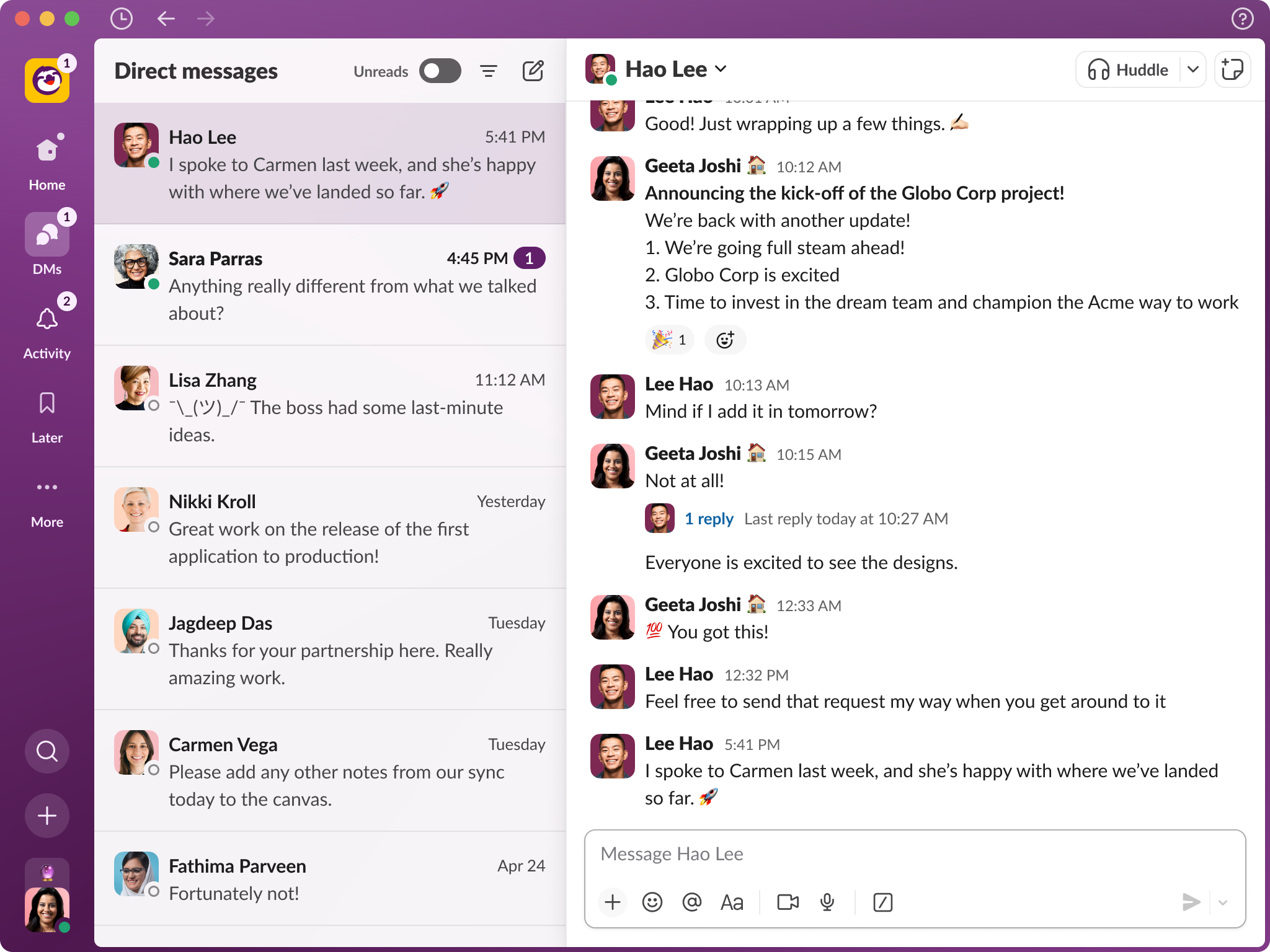
With that in mind, one of the key design ideas was to centralize a lot of the information that was in lists in the old version. For instance, by clicking the DMs button in the new interface, you can find all of your DMs in one place. This is a drastic improvement over the prior approach and lets you interact with all of your DMs in a single view.

New dedicated Slack DM view. Image Credits: Slack
In addition, there is an Activity page where you can see all of the messages for you related to your work without having to hunt and peck for it. This allows you to very quickly see the work that’s relevant to you.
If you want to mark one of those items to get back to later, you can do that, and then check the Later page to see all those tasks you put off in a single place. Again, the idea is to simplify the workflow.
The More button gives access to canvases, workflows and integrated enterprise applications.
Finally, you can also search with the magnifying glass icon and add a new message, canvas, huddle or channel from the + button.
Finally, Weiss said that the company wanted to future-proof the platform with an eye towards generative AI, knowing that AI will play a key role in helping people find and summarize the growing amount of information in the platform.
“There are 2500 apps in the Slack App Store, and all of your first party tools, if you’re a large enterprise, get integrated into Slack and get combined with all of your conversations which happened in channels, and suddenly you’ve got this amazing knowledge repository that builds up naturally over time. A lot of these generative AI capabilities will allow you to then have a much more conversational approach to unlocking the knowledge that’s inside Slack,” he said.
The company is beginning to roll out these changes today, but it could be several months before you begin to see them. Weiss points out that the changes you’ll see will depend on your plan.
It’s worth pointing out that the company included this odd caveat in its announcement: Any unreleased services or features referenced here are not currently available and may not be delivered on time or at all. Customers should make their purchase decisions based upon features that are currently available.
You can take that as you will.
Source link

